Heidi’s House
Inspired by vintage design, the Heidi's House living room by Heidi Caillier showcases nostalgic details, charming pattern combinations, and bold color in a space that feels genuinely loved and personal. The look draws on the richly layered, pattern-confident interiors of the past — a room where wallpaper and upholstery and rug can all hold pattern simultaneously because the palette connects them — updated with contemporary material quality and Heidi's highly specific editorial eye. The result is a room that looks like it has been lived in lovingly for decades.
What defines Heidi Caillier's design aesthetic?
Heidi Caillier is a Seattle-based interior designer known for her fearless color sense, deep pattern confidence, and the collected, character-rich quality of her interiors. Her work frequently references Victorian, Arts and Crafts, and historic American domestic design traditions — not as reproductions, but as starting points for spaces that feel both deeply rooted in history and entirely personal. The Lulu and Georgia collaboration with Heidi brings her aesthetic to a curated room look that reflects her approach to color, pattern, and the idea of a home that accumulates rather than arrives complete.
What colors and patterns define the Heidi's House look?
The collection is organized around bold, historically-rooted color choices — deep greens, warm reds, dusty plums, rich blues — combined with pattern in multiple layers: a patterned rug, patterned upholstery or wallpaper, and pattern-adjacent textiles and objects. The patterns Heidi chooses tend to have historical or botanical references: floral, leaf, and geometric motifs that feel connected to the Arts and Crafts and Victorian design traditions she draws on. The palette is saturated but never garish — every color choice is warm-toned and muted enough to read as considered rather than loud.
How do I incorporate bold color confidently in a living room?
Confidence with color comes from commitment to a palette rather than from using any single bold hue. Choose your colors deliberately — typically one dominant saturated tone and two supporting tones — and use each consistently across the room at different scales and on different surfaces. A deep green as the dominant sofa upholstery color should also appear in a rug, a pillow fabric, or an adjacent plant; a bold red as a secondary should appear in accent pieces and a textile rather than being isolated on one piece. This repetition creates the palette coherence that makes bold color read as designed rather than arbitrary.
Also explore: Sofas | Wallpaper | Vintage Rugs | Accent Chairs | New Arrivals
-
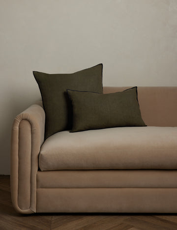 Carys Contrast Linen Pillow
From $78.00
Carys Contrast Linen Pillow
From $78.00
-
 Wrinkle Decorative Bowl by Sarah Sherman Samuel
From $35.20
Wrinkle Decorative Bowl by Sarah Sherman Samuel
From $35.20
-
 Mariata Pillow
From $114.00
Mariata Pillow
From $114.00
-
 Selden Bowl
$28.00
Selden Bowl
$28.00
-
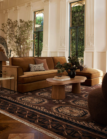 Caprice Hand-Knotted Wool-Blend Rug
From $478.00
Caprice Hand-Knotted Wool-Blend Rug
From $478.00
-
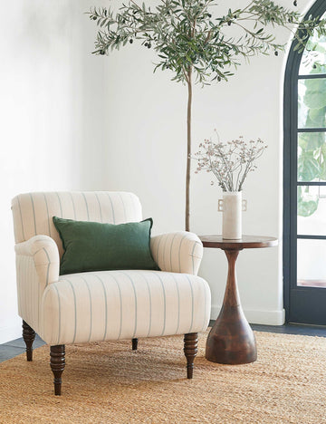 Vyolet Accent Chair
From $1,098.00
Vyolet Accent Chair
From $1,098.00
-
 Garden Essentials Candle by Flamingo Estate
$64.00
Garden Essentials Candle by Flamingo Estate
$64.00
-
 Romaric Jacquard Pillow
From $90.00
Romaric Jacquard Pillow
From $90.00
-
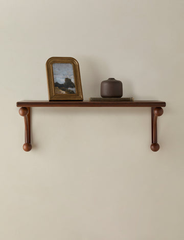 Haisley Picture Frame
From $84.00
Haisley Picture Frame
From $84.00
-
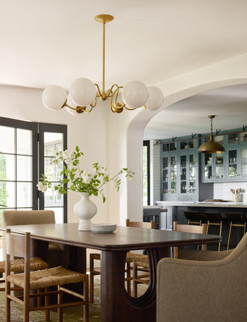 Julius Chandelier
From $924.00
Julius Chandelier
From $924.00
-
 Lucca Round Side Table by Heidi Caillier
$398.00
Lucca Round Side Table by Heidi Caillier
$398.00
-
 Manca Hand-Knotted Wool Rug
From $158.00
Manca Hand-Knotted Wool Rug
From $158.00
-
 Pittman Table Lamp
$298.00
Pittman Table Lamp
$298.00
-
 Virgil Taper Candle Holder
From $18.00
Virgil Taper Candle Holder
From $18.00
-
 Poiret Grasscloth Wallpaper
$548.00
Poiret Grasscloth Wallpaper
$548.00
-
 Paley Accent Chair by Heidi Caillier
From $1,398.00
Paley Accent Chair by Heidi Caillier
From $1,398.00
-
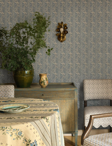 Garda Sconce by Heidi Caillier
$298.00
Garda Sconce by Heidi Caillier
$298.00
-
 Kent Square Coffee Table
$1,188.00
Kent Square Coffee Table
$1,188.00
-
 Danser Tray
From $134.00
Danser Tray
From $134.00
-
 Dowd Side Table
$455.00
Dowd Side Table
$455.00
-
 Francis Floor Lamp by Heidi Caillier
$798.00
Francis Floor Lamp by Heidi Caillier
$798.00
-
 Campden Vase by Heidi Caillier
$74.00
Campden Vase by Heidi Caillier
$74.00
-
 Batten Flatweave Wool Rug
From $359.00
Batten Flatweave Wool Rug
From $359.00
-
 Roma Accent Chair by Heidi Caillier
$998.00
Roma Accent Chair by Heidi Caillier
$998.00
-
 Benice Reversible Tapestry Pillow Cover by Twenty Third x Deanne
From $74.00
Benice Reversible Tapestry Pillow Cover by Twenty Third x Deanne
From $74.00
-
 Powell Wall Mirror by Heidi Caillier
$448.00
Powell Wall Mirror by Heidi Caillier
$448.00
-
 Fillmore Checkered Paperweave Wallpaper by Heidi Caillier
$548.00
Fillmore Checkered Paperweave Wallpaper by Heidi Caillier
$548.00
-
 Salvador Round Coffee Table by Amber Lewis x Four Hands
$1,799.00
Salvador Round Coffee Table by Amber Lewis x Four Hands
$1,799.00
-
 Masera Sofa
From $1,898.00
Masera Sofa
From $1,898.00
-
 Portola Pleated Sectional Sofa
From $9,948.00
Portola Pleated Sectional Sofa
From $9,948.00
-
 Pallie Pendant Light
$550.00
Pallie Pendant Light
$550.00
-
 Armel Stool
From $649.00
Armel Stool
From $649.00
-
 Ivone Side Table
From $1,892.00
Ivone Side Table
From $1,892.00
-
 Soter Linen Curtain Panel by Heidi Caillier
From $368.00
Soter Linen Curtain Panel by Heidi Caillier
From $368.00


